**Responding to my feedback & Creating the back cover page
- Bethany Capstick

- Jun 11, 2019
- 5 min read
Updated: Jun 13, 2019
From my feedback I was told a few times that the back cover page looked bland and unfinished so I did further research and found out that most magazines would have their social media icons at the bottom of the page.

So i decided to move my icons to the bottom left corner and to delete he text that was there before as wells as the boxes. I was then told I should add a barcode to the magazine so I added one even though I originally planned I wouldn't as its an online magazine and you wouldn't need to scan it to purchase it.
This then left me with the upper section of the page which was blank so I then got the idea of adding tour dates on the back page for Shawn Mendes as the image is of him.
This meant I had to collect the dates that I could put on it as well as trying to use the same style as him when he is advertising his dates.
The first screenshot is from the Shawn Access app that I have on my phone and gives me all of the upcoming dates for his shows all around the world, I will use the dates from this app to put on the back page.
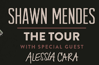
The second screen shot was from his instagram where he is advertising the dates himself on a post. Throughout the tour he has kept the same theme of colour and text font so I will try to replicate this as much as I can.

I also googled what tour posters look like for pop music as that is the main genre of the magazine and it will give me an idea on how to layout my design. (Tour poster research in a separate blog)
(Image source on sources document on production page)
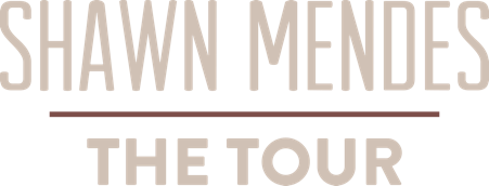
I found this image of the tour logo so i decided to use it for my back page and it was already on a transparent background so no editing was needed. I then placed it at the top of my page in the centre and I think that it already looks better and more professional than what it previously was before.
Font:
When I was searching the fonts thats he has used the first ting I found was that 'Brandon Grotesque Bold' was the font that was used for his single In My Blood. The font is sans serif Designed by Hannes von Döhren. However this font is unable to download so I wouldn't be bale to use this. https://fontmeme.com/in-my-blood-font-2/
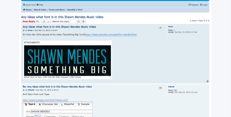
https://forum.high-logic.com/viewtopic.php?t=5866 (first screenshot) This site told me about which font that he has used for his name on the logo which was ARVIL, the font has strong lines with rounded, soft terminals, to produce a strong, yet clear letterform. I then went onto dafont to see if the font was available to download and I was unsuccessful so I decided to search for where I could download it and i came across https://www.onlinewebfonts.com/download/41cf7369b23047c2c50a5a158de4977c (second image) and I was able to download this font for free.

Once I downloaded the font I opened the file then went to the font and opened it with font book so I was able to download it onto photoshop.
My plan it to write all of the dates and ect on photoshop and then remove the background, so I will be able to export it as an image on a transparent background so i'm able to easily input it onto flipsnack. I am also going to try and find the Brandon Grotesque Bold font that Shawn has used for his single on the site and I will change the font of the text I have written and compare which font I prefer and which would look better.

This is how I was creating my contents page and I had up an image of a tour dates announcement that was done so I can copy the style.
I started by opening a new photoshop document but, I made sure that I used the same page size so I wouldn't have any problems with resizing it on flipsnack.
Once I had my document I started adding my text using the ARIVL font. I am only going to write the date and the city the shows are in in the next two months so it all fits on the page and doesn't cover the main image.
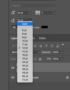
When I started to write up the dates and cities I realised that there was a large spacing between each of the days, this was because the spacing setting was on Auto, so I made the spacing 12 as it made it look close together a but clear they are separate.
Once I had written all of the dates and cities out I quickly exported it as PNG to see what it would look like on the page. I thought it wasn't bold enough and the text was thin which made it all look squashed together and makes it harder to read so I decided to find the Brandon Grotesque Bold font which Shawn has used.
https://www.downloadfonts.io/brandon-grotesque-font-family-free/ was the site that I found where I could download this font. I then used the same process to import the font onto photoshop.
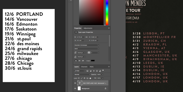
This is what the lists looked like when they were completed, next to each other, however in the second image I had to use upper case to make it look like the original advertisements. I then decided I would use the second version as it looked like the the most similar and it was also a lot bolder.
Once I has completed both of my lists and re-typing the letters out so they were in the upper case I wanted to change the colour of the text as the black wouldn't be able to bee seen and I want to match Shawn's style as people would aromatically recognise the font and colours that were used and know its about him.
To get the same colours I used the eye drop tool and clicked on the logos colours so I could use the exact colours.
I made the dates in the beige colour and then the cities in the maroon colour and then I unlocked the background layer so I was able to delete it to create a transparent background.
Once I put both lists onto flipsnack some of the text was harder to read as the lights in the image were in the way of the text. I then went into Photoshop to see if I could add a black outline to the text, but I was unable to do this as it was a downloaded font. So I then had to make the text black and put it behind the original lists.
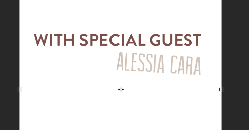
After I had done that I needed to include the supporting act, I used the same colours and my lists and made sure that Alessia name was in a different font. I was unsure of which font to use for her name so I decided to use the ARIVL font that I originally downloaded and put her name on an angle. When I put this on the page it didn't look right and fit in with the theme, I think this was because the text wasn't long and under the tour logo made it look like a block of text so I decided to change what the text said said and the font for Alessia's name.
I changed the text from saying 'with special guest' to 'upcoming shows with special guest' as it was longer and stood out more, I then also changed the font of the supporting act in to a more bolder and thicker font and put it at the bottom of the page as it looked bare.

This is my end product from my feedback and back cover page.

















Comments