Comparing Magazine Covers
- Bethany Capstick

- Jun 18, 2019
- 1 min read

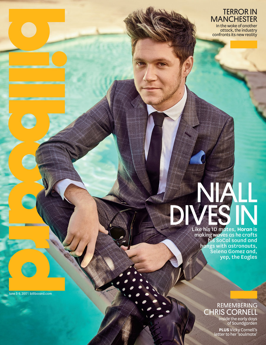
On my Cover I have included a masthead, cover lines, date and a main image which all magazine covers have. My masthead is the biggest text as it needs to be the first thing the audience reads to recognise it, my heading is at the top of the page like the majority of magazines whereas Billboard , a music magazine, has it on the side.
Next, my cover has two cover lines which is a good amount but some magazine can have up to 1-5, however which my background photograph I didn't want too much text to cover it. My cover lines are the same style as billboard where the statement is bolder so it would catch the audiences eyes and then a small overview below it in a much smaller font that tells the reader more about the article inside.
My magazine also has the date bellow the masthead which both the Billboard and Vogue magazine does in a small font, this just tells the reader what issue the magazine is.
Magazines covers also have a clear colour scheme, they either use a main colour or use a rage of colours. Billboard uses colours that compliment each other and depending on the season they'll have different colours like in summer they would use bright colour whereas in winter they would use either cooler tones or more neutral colours. On this Vogue cover they have used warmer tones and used red as a solid, feature colour which is used for the masthead and some cover lines.


Comments