Tour poster research and analysis
- Bethany Capstick

- Jun 11, 2019
- 2 min read
From my feedback I has told to improve my back cover page, so I am going to create this an advertisement for Shawn Mendes's upcoming tour dates. This means that I am going to have to do some research on his house style from the tour and use it to try and replicate it or use as similar idea for my page.


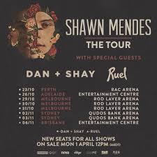


This was the ascetic and house style Shawn has used for his current tour and has used it to advertise all the shows he played at and that are upcoming, he has also used this style to announce supporting acts such as Alessia Cara, DAN+SHAY and rule. The style is very minimalistic and ascetically pleasing as there isn't many images, one at the most, on the style of the posters are consistent and simple.
For my poster I am going to list the show dates with the arenas stated, use the same logo of 'Shawn Mendes The Tour' and write who the supporting acts are for the dates.


This was the tour poster for his last tour and he has use a similar style this time just changing the colours and fonts.
He has used a main image which would be used to advertise the whole tour and any other merchandise, next to the image there is the tours logo which would also be on the merchandise. However when they have written who the special guest (supporting act|) is they have used a different font to make their name stand out. Then bellow is the tour dates, cities and venues he is playing at in the same font with the the cities being in white and then the arena and date being in the blue colour which is used in all the adverts. For this years tour advertisements he has used a similar layout but just altering the design according to this tour and the colour scheme.


Comments