The process of creating my poster
- Bethany Capstick

- Dec 18, 2018
- 1 min read
Updated: Jan 23, 2019


These are the two poster i am planing to use to help create my poster. My plan is to blend the two images together so nelsons eye is one the left side and the bridge is on the right.


First of all i changed the bridge picture to black and white. I am doing this as the genre of the film is horror and i don't think that the image with the colour would be suitable to use with that genre as its very bright.

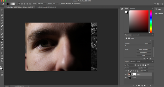
Here i have moved the picture of Nelson's eye on top of the bridge background and unlocked the background as well as adding a mask to layer 1. I am trying to add a gradient to the mask, but when i do it it doesn't work.
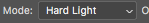
I then found out that it wasn't working as i was on 'soft light' so i changed it to 'Hard Light' and then the gradient started working how i wanted it to.


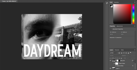
Once i had figured out adding the gradient i changed both images to black and white. And added the title of the films name, Daydream, in the Crumble font i got from dafont and then changed the colour of the text to white.


I then added the release date and mine and Nelsons names at the top, as they are important and it will help advertise the film.


Comments