The Cover
- Bethany Capstick

- Apr 29, 2019
- 3 min read
Updated: May 8, 2019

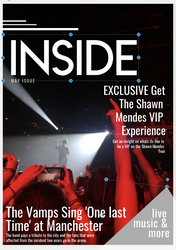
The first thing I did was inserting the cover image that I am using that I took at a concert I previously went to. I chose this image because it clearly give the audience an idea what the magazine is about. I also liked the lighting in the images as the spotlight created a silhouette of the artist that was performing and the red lights added some tone to the image. Having the red light also helped me create my colour theme. Another reason why i chose this picture is because of the layout of it. it has a large area os space at the top of the image where I can put my Masthead and then at the bottom it has people from the crowd and their hands are up. The image is a fans point of view which could also attract the readers as it the view they would get if they were there.
Original photo taken by me at The Vamps: Night and Day tour in Manchester Arena, 5th May.


The next thing I did was adding my masthead which I exported from photoshop. I am suing the white copy because where I am placing the text is back and It stands out and if i used the black heading you wouldn't be able to see it. I decided that I wasn't gong to put it right at the top as there was too much space below it so I moved it down so it was centred in the dark section of the image.


I then decided to add a rectangle but i then made them thinner so they were more like lines. I added three of these on top of the masthead in different sizes and lengths to add something to the cover and reduce the amount of empty space used.


The image above is my cover that I have created so far. Underneath the masthead i have written 'May issue' ,in the oslwad font, as the magazine is going to be a monthy issue and the assignment is due in may. In the right hand corner I added a grey triangle where i could put some extra information. Adding this would make this text stand out so i decided to put ' live music & more' so people would be able to know what is going to be inside my magazine and what its about. I also used grey as thats going to be a colour that i will use through out the magazine (as well as red, black and white) and i also wanted to avoid any colour clashes using a different one.
The fonts that i am using are also the same style as the masthead, using the straight edges and the width being thinner.
--------------------------------------------------------------
I have included two cover lines on the cover, as well as a short summary bellow it, i have done this to show the featured articles and so the audience will know what is inside the magazine. The first one is an exclusive and it is about a VIP experience on the Shawn Mendes tour. Before the cover line i wrote 'Exclusive' all in upper case to draw the attention of the readers. I have also aligned the text to the right.
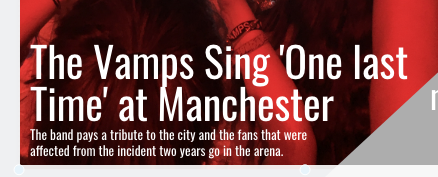
The second cover line was about The Vamps and when they did a tribute performance at the manchester arena. I have used this a cover line as they are also having a page in the magazine and their lead singer Bradley Simpson is on the cover. i also thought this was relevant as all of the concerts that are being reviewed in this magazine where in manchester.
From my research I have found that all of the cover lines that are on the cover are larger and bolder than the brief overview below it.
I am not putting a barcode on my magazine because its only going to be available online and if this was a real magazine i would want it to be a subscription where you pay monthly for the issue and you can get the digital and a print copy if its wanted by the reader.


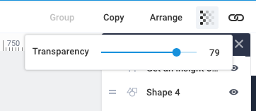
I then thought about changing the transparency and i think when i reduced it it looked better as you could still see part of the background through it and it made the text stand out.


Comments