The Contents page (and feedback given on it)
- Bethany Capstick

- May 1, 2019
- 2 min read
This is the process of me creating my contents page
The font i am using for this page is the Oswald font which i used on my cover. I am using this font again as its bold and using a consistent font throughout the magazine would make it look more appealing and organised.
The colour theme of my magazine was red so i decide that there needed to be some aspects of red in the magazine but not too much red.
From my research on magazine layouts i liked how they were layering different colour and shapes so i used that idea on mine. I used three squares and resized them into a rectangle and layered them, before layering them i changed the colour of the rectangle in the middle, to a darker shade of red, so there wasn't a big block of colour.

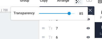
I then decided that the darker shade of red dint really go and stand out so i changed it to grey. I also used grey on the cover of the magazine and i am planning on using it throughout the magazine so it evens out the colour usage of the red. I then changed the transparency of the grey in correlation to the cover, i liked this more as you could se the shape behind it and is shows the style i want. I also changed the transparency of the bottom red rectangle but then i changed it back to 100%.


Once i was done with the shapes i then continued with labelling the pages next to the number of the page. I also corrected my spelling mistake of music. I made the numbers larger than the text so they stood out.


I the added one of the images i took ,at the Shawn Mendes concerts, to make it look less boring. I am still indecisive about having the image here but i am going to ask people whether they prefer the page with or without the image. The image also has red in it and its a similar shape.
Feedback:
I asked Ethan on which version he preferred and he said he like the one with the photograph better as he would want a magazine with pictures in it so he can look at something and not get bored of all the reading he had to do, he also said that he likes how the shape of the image fits in with the shapes behind it and he likes the idea of the layering.


Comments