Creating a spread
- Bethany Capstick

- May 7, 2019
- 2 min read
Updated: May 8, 2019
The site I am using is Flipsack. I am doing a magazine spread o the Shawn Mendes Concert i went to however when using the site you can't work on the two pages of the spread together, you have to work on them separately. So am going to have to keep switching between the pages and the preview so the pages will look good together and match up.


I also decided that the page numbers were to big to i reduced the size to 30. I also know that its better to have the page numbers in the same place on all of the pages however as this is a spread i decided to move the number to the right hand side as it looked out of place ad would get in the way of text or pictures.
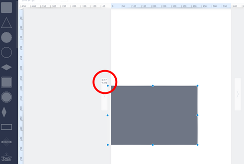
As this is a spread I want the two pages to blend together and i want to use all the space i can to make it look how i want. Because i cant work on the pages together i have to use the measurements on the sides and and the coordinates to make sure they match on both pages.
This is my design I have created (changes may be made), I have used a similar design to the contents page by using the shapes and colours. I have used grey and red squares and i have also resized some of these shapes so they aren't the same shape which i like and makes it more interesting. I have also changed the transparency of two of the grey shapes as i have done on previous pages, keeping a theme throughout my magazine will make it more appealing to the audience and it makes it look more professional and uniformed.

I changed the way my heading looked by making the font larger and I made the edges of the 'h' and 'M' match up and the 'n' and 'd' s it looked neater.


Comments